Tools Used
- InDesign
- Illustrator
Skills Demonstrated
- Information hierarchy and prioritization
- Content simplification and restructuring
- Designing for audience comprehension
- Balancing stakeholder requirements with audience needs
Project Description
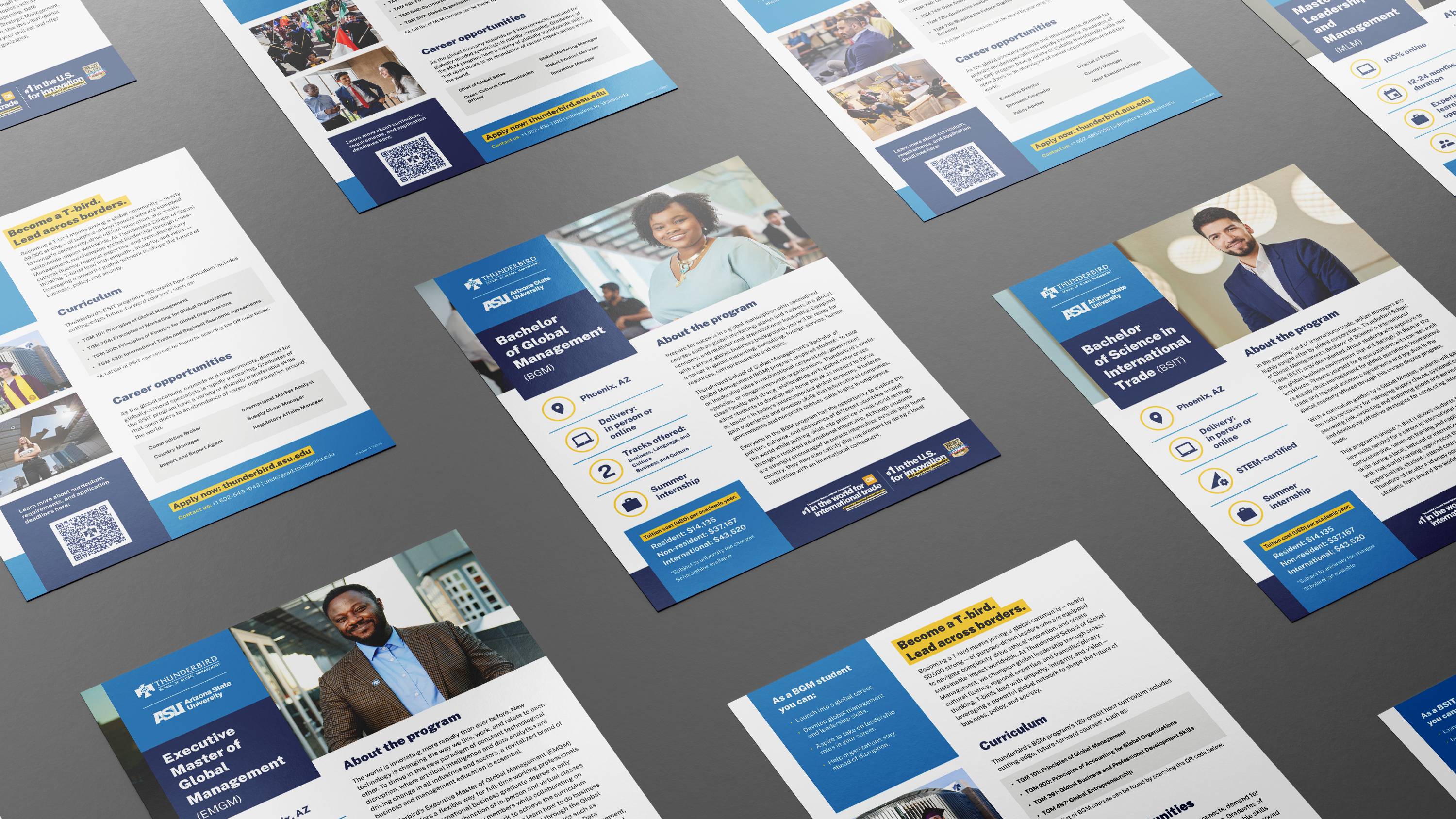
When I stepped into my role as Graphic Design Lead at Thunderbird School of Global Management, the degree program flyers quickly emerged as a high-priority redesign opportunity. These materials are often a prospective student’s first in-depth interaction with a program, yet the existing layouts were dense and visually overwhelming. Information was compressed, sections felt rigid and disconnected, and supporting graphics appeared secondary rather than purposeful. I identified an opportunity to rethink these flyers with greater clarity, hierarchy, and intention—creating a system that better reflected the quality of Thunderbird’s programs and supported prospective students in making confident, informed decisions.

Design Considerations
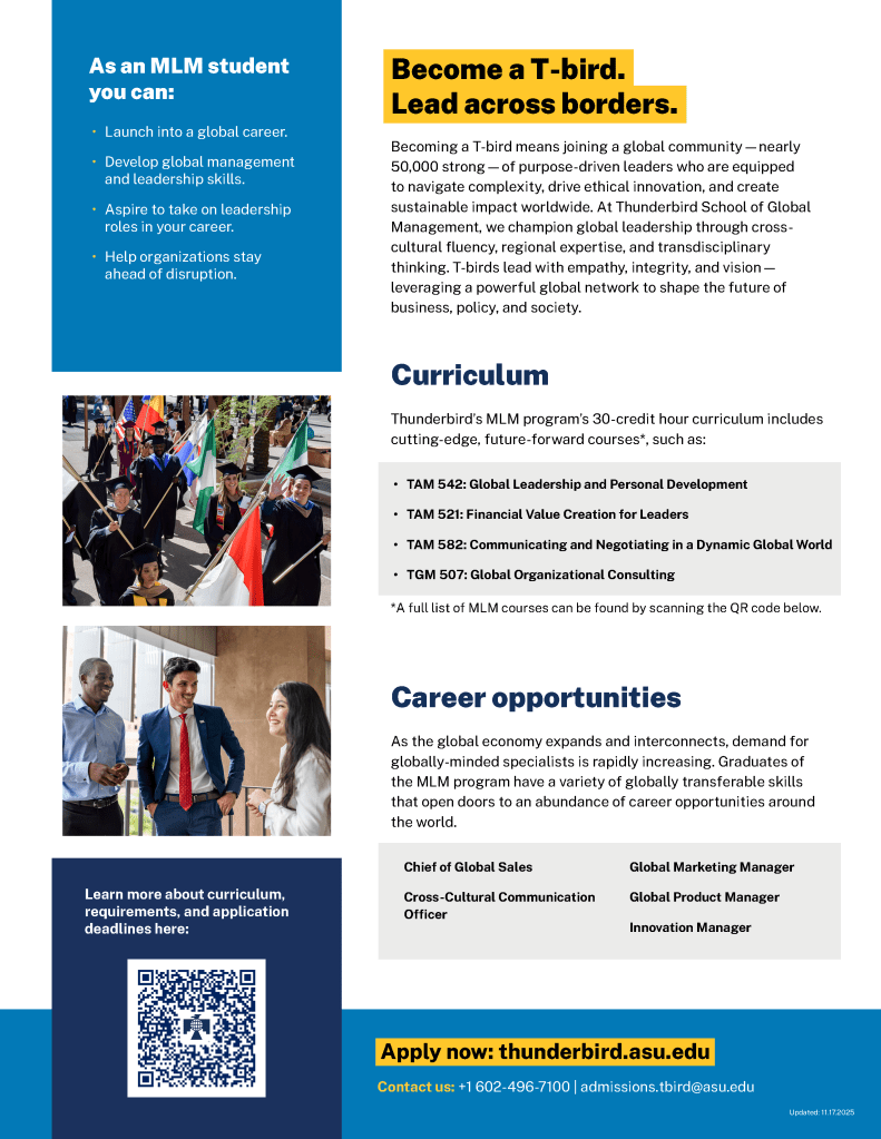
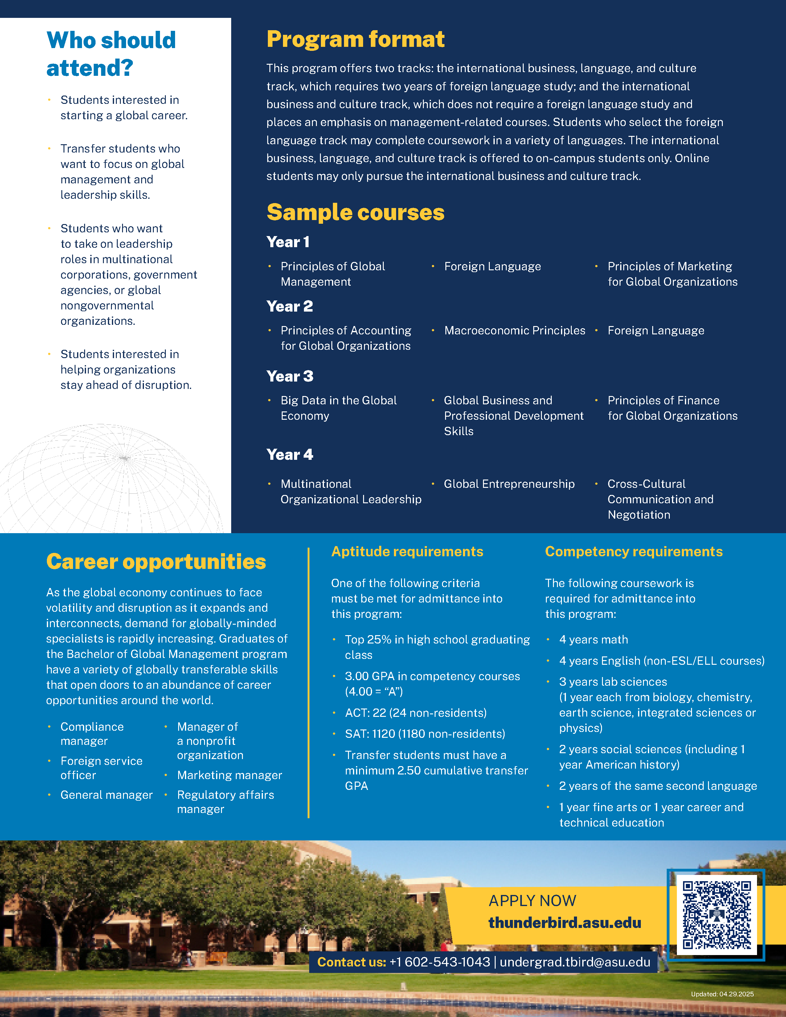
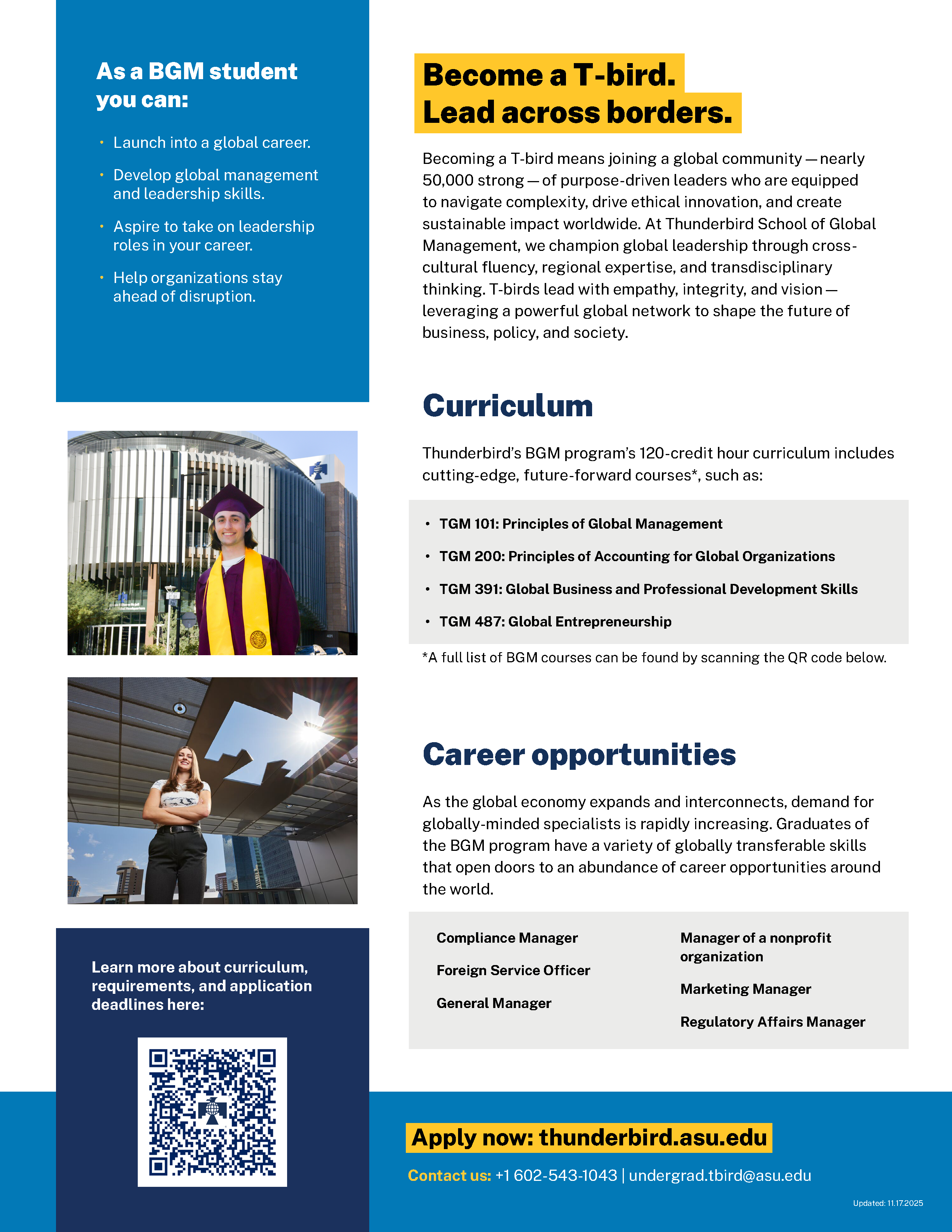
I began the redesign process by identifying the most critical information that needed to be retained across all program flyers. To ensure the content hierarchy aligned with recruitment goals, I collaborated closely with key stakeholders across branding and communications, as well as the recruiting and admissions teams, to clarify the primary purpose of this collateral. Sections identified as lower priority were intentionally removed from the print layout and preserved on the website for reference, with a clearly placed QR code and call to action guiding prospective students to learn more online.
Based on these insights, I reorganized the remaining content into clear, logical sections and developed a layout system designed to scale across Thunderbird’s full portfolio of degree programs. A consistent vertical sidebar was introduced along the left edge of both the front and back of each flyer to house concise, high-impact content such as program highlights, tuition information, and calls to action. This allowed the right side of the layout to focus on more detailed program information, supported by clear, bold section headers that improved scannability and comprehension. I also redesigned the accompanying infographic to be more visually engaging while occupying less space, creating a strong visual anchor within the sidebar and contributing to a more balanced, cohesive reading experience.


Results
- Clean layout
- Content sections optimized for scannability
- Clear, complementary visuals
- Increased legibility and information digestion
- Cohesive design system across multiple degree program flyers with varied content requirements
This project was especially rewarding, as it challenged me to evaluate a large body of established materials and thoughtfully transform them into a more effective and refined system. The redesigned flyers are more readable, concise, and visually engaging, with a clear hierarchy that makes key information easy to scan and understand. The intentional layout reduces clutter, strengthens brand consistency, and better reflects the quality and professionalism of Thunderbird’s degree programs.
