Tools Used
- Figma
- Illustrator
Skills Demonstrated
- UI/UX design and wireframing
- Information architecture and content prioritization
- Designing for intuitive navigation
- Translating print materials into digital experiences
- Balancing internal and external user needs
Project Description
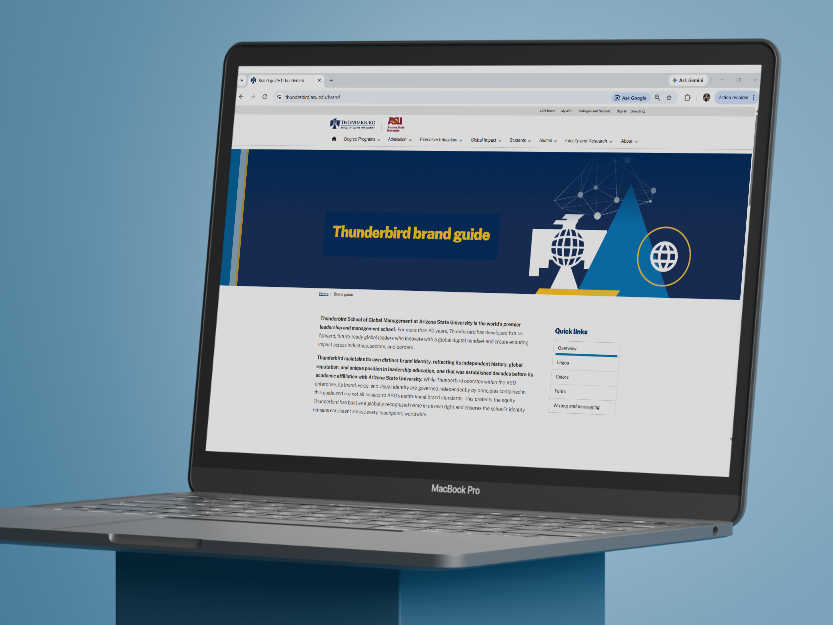
Thunderbird School of Global Management’s brand guidelines previously existed as a nearly 90-page PDF containing everything from foundational brand standards to detailed instructions and use-case examples. While comprehensive, the document was difficult to navigate, making it challenging for users to quickly locate and understand the information most relevant to them.
I identified an opportunity to transform the traditional brand guide into a streamlined digital experience—prioritizing essential information, improving accessibility, and creating a resource that could better serve both external audiences and Thunderbird employees.
Design Considerations
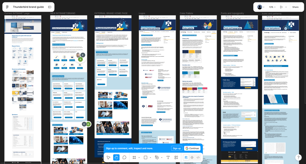
I began by evaluating the existing brand guide and identifying the information most essential for external audiences. Rather than translating all 90 pages directly into a website, I pared the content down to core brand principles and reorganized it into clear, intuitive sections designed for quick navigation.
Using Figma, I developed a wireframe that established the site’s information architecture, page structure, navigation, and content hierarchy. The interface was designed to make key guidelines easy to scan and understand while eliminating unnecessary complexity.
I also considered the different needs of external and internal users. Core brand guidance would remain publicly accessible, while Thunderbird employees could log in with their organizational email to access downloadable brand assets, including approved logos and typefaces. This approach keeps the public-facing experience simple while providing employees with the additional resources they need to create brand-aligned materials.
Hero Imagery
To give each section of the website a distinct visual identity, I also designed custom hero imagery for the primary pages. Each image was created to complement the subject of its respective section while remaining cohesive with Thunderbird’s overall visual language.
The hero graphics helped break up the more technical nature of the brand guidelines and introduced visual storytelling into the experience. By combining Thunderbird brand elements, and thoughtful compositions, I created imagery that makes the site feel more engaging while reinforcing the brand standards demonstrated throughout the content.







Results
- Streamlined brand guidelines focused on essential information
- Clear, intuitive navigation and information architecture
- Custom hero imagery to distinguish and enhance each section
- Simplified access to commonly used brand standards
- Dedicated employee access to downloadable brand assets
- More approachable and accessible brand experience
After establishing the site architecture, wireframes, visual direction, and UI/UX in Figma, I prepared the designs for development and collaborated closely with a web developer on our team. My colleague translated my vision into a fully responsive web experience, adapting the interface across desktop and mobile while preserving the hierarchy, navigation, and visual system established in my designs.
The resulting wireframe transforms a dense, static document into a focused and user-friendly digital resource. By prioritizing content and designing around how audiences actually interact with brand guidelines, the new experience makes Thunderbird’s standards easier to navigate, understand, and apply. The project also provided an opportunity to expand my UI/UX skills by translating an established print resource into a thoughtful digital experience.

